How to Integrate Swiper JS in Your Webflow Project in 4 Easy Steps
In this guide, I'll walk you through how to integrate Swiper JS in your Webflow project.
I’ll also show you how to organize your CSS and JavaScript for the best experience in the Webflow Designer.
If you're looking to add a stylish, responsive slider to your Webflow site, Swiper JS is a fantastic choice. It offers customizable settings, smooth animations, and full control over the look and feel of your slider.
Unlike Webflow's native slider, which lacks CMS support and can be clunky and difficult to adjust, Swiper JS provides a more seamless and customizable experience.
Step 1: Adding HTML Structure in Webflow
The first step is to add the HTML structure for Swiper to work. I’ve added combo classes to the HTML in order to distinguish this instance of Swiper from other instances on the website.
Swiper CMS Setup
If you want to use Swiper with Webflow’s CMS, which is one of the reasons you likely looked into Swiper, you would need to map Swiper’s standard HTML setup to Webflow’s CMS Collection List setup. See Swiper’s standard setup in the next section below.
Here is how to map Swiper’s Standard Setup to Webflow’s Collection list setup:
collection-wrapper = swiper
collection-list = swiper-wrapper
collection-item = swiper-slide
Add an additional wrapper
I’ve also added .swiper-component as a wrapper for the entire slider.
I added .swiper-component as a wrapping div because I can’t put the navigation arrows and the pagination inside .swiper in a Collection List in Webflow. Webflow won’t allow you to nest non-collection list items inside a collection list. So, instead of nesting everything inside .swiper, like Swiper requires, I nested everything inside an additional div .swiper-component (note: .swiper-component is not a part of Swiper’s suggested setup, meaning you won’t find a reference to it in their documentation).
Additionally, I’ve added position: relative to the .swiper-component to account for the default behavior of .swiper-pagination which is absolute.
Note: I changed .swiper-pagination to position: relative in my CSS for better spacing control.
<div class="swiper-component is-portfolio">
  <div class="swiper is-portfolio">
    <div class="swiper-wrapper is-portfolio">
      <!-- Dynamic slides added here via Collection List or manually I'm adding an image only, but you would add whatever you want on your slide here and style it appropriately -->
      <div class="swiper-slide is-portfolio">
        <img src="YOUR_IMAGE_URL" alt="Slide Image" />
      </div>
    </div>
  </div>
  <!-- Navigation Arrows -->
  <div class="swiper-arrow-wrapper is-portfolio">
    <div class="swiper-button-prev-portfolio"></div>
    <div class="swiper-button-next-portfolio"></div>
  </div>
  <!-- Pagination -->
  <div class="swiper-pagination is-portfolio"></div>
</div>
Swiper Non-CMS Setup (Regular Setup)
If you are not using Swiper with a CMS collection list, then you would setup Swiper as follows (The HTML below is pulled directly from Swiper’s documentation)
Notice that .swiper wraps everything. In this instance, you wouldn’t need a .swiper-component that wraps everything. The .swiper div acts as the component that wraps everything. It is is given position: relative by default to handle any position: absolute elements inside.
<!-- Slider main container -->
<div class="swiper">
  <!-- Additional required wrapper -->
  <div class="swiper-wrapper">
    <!-- Slides -->
    <div class="swiper-slide">Slide 1</div>
    <div class="swiper-slide">Slide 2</div>
    <div class="swiper-slide">Slide 3</div>
    ...
  </div>
  <!-- If we need pagination -->
  <div class="swiper-pagination"></div>

  <!-- If we need navigation buttons -->
  <div class="swiper-button-prev"></div>
  <div class="swiper-button-next"></div>

  <!-- If we need scrollbar -->
  <div class="swiper-scrollbar"></div>
</div>
Navigation Button Naming
One thing to take note and possible change in your project, if you copy the HTML from Swiper’s documentation, is the class name of the navigation buttons.
The names are Swiper defaults, which means these buttons are styled using Swiper’s CSS. That is not a big deal if you want the default arrows. You can change the color of these arrows.
But, if you want to use custom button’s in your project, you will want to give them another name, like I did above in my CSS.
If you don’t give them a different name, the arrows Swiper adds on page load will stay in your project. You will end up with two sets of buttons and some weird behavior.
If you decide to deviate from Swiper’s navigation button names, you will also need to change this in the JavaScript below so Swiper will know which buttons to target for navigation.
// Navigation arrows configuration
       navigation: {
           nextEl: '.swiper-button-next-portfolio',  // CSS selector for "next" button
           prevEl: '.swiper-button-prev-portfolio',  // CSS selector for "previous" button
       },
Changing the JavaScript, will also tell Swiper not to create the default navigation buttons in your project.
I didn’t know to make this naming change the first time I worked with Swiper. And it caused me a lot of headache and wasted time as I couldn’t get Swiper’s default navigation buttons to disappear.
After looking at multiple projects with custom navigation buttons, I noticed the class name was different from Swiper’s standard setup. Only after I changed the class name of the button’s in my HTML and my JS did the default buttons disappear.
Additional HTML and Designer View
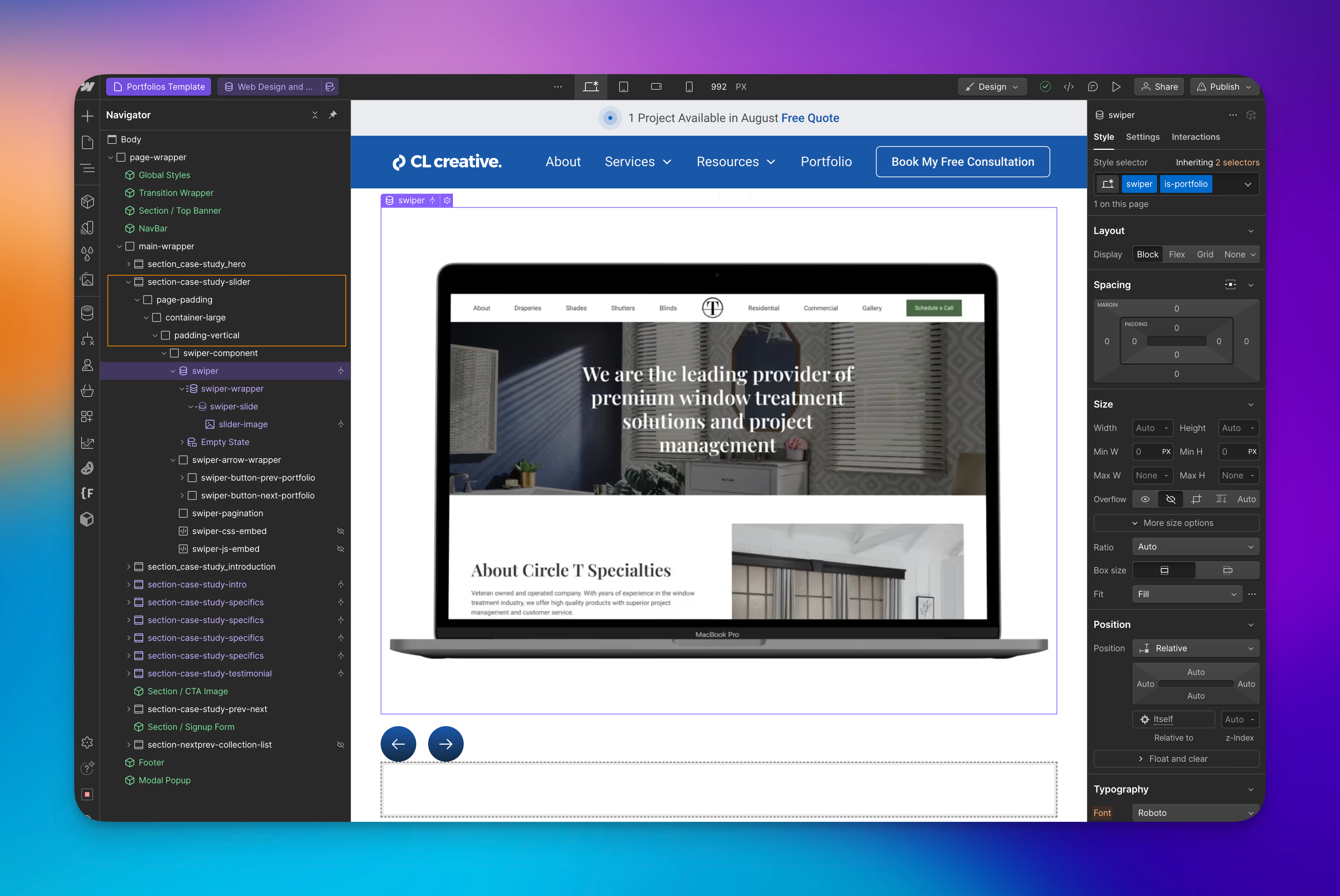
Additional HTML
The two HTML setups I provided above only cover the necessary elements to use Swiper JS with and without Webflow’s CMS. You most likely want to add your slider to a section as you can see I have done in the image above. I did not include this additional HTML in the two setup’s above since your setup might be different than mine.
Designer View
Since Swiper JS is a JavaScript library we are adding to our Webflow project, your slider will not look like the final product in Webflow’s Designer as it will on the published website. That is because, in many instances, you use Swiper’s JavaScript library to control both how the slider looks and functions.
For instance, I have my options set to show 1.5 slides on desktop. In the image above, you only see one image instead of 1.5 images. As well as the image is much larger than it will show on the published site.
All that being said, don’t worry if your slider doesn’t look like a slider in Webflow’s Designer. Instead, focus on the settings in your JavaScript, knowing it will render correctly on the published site.
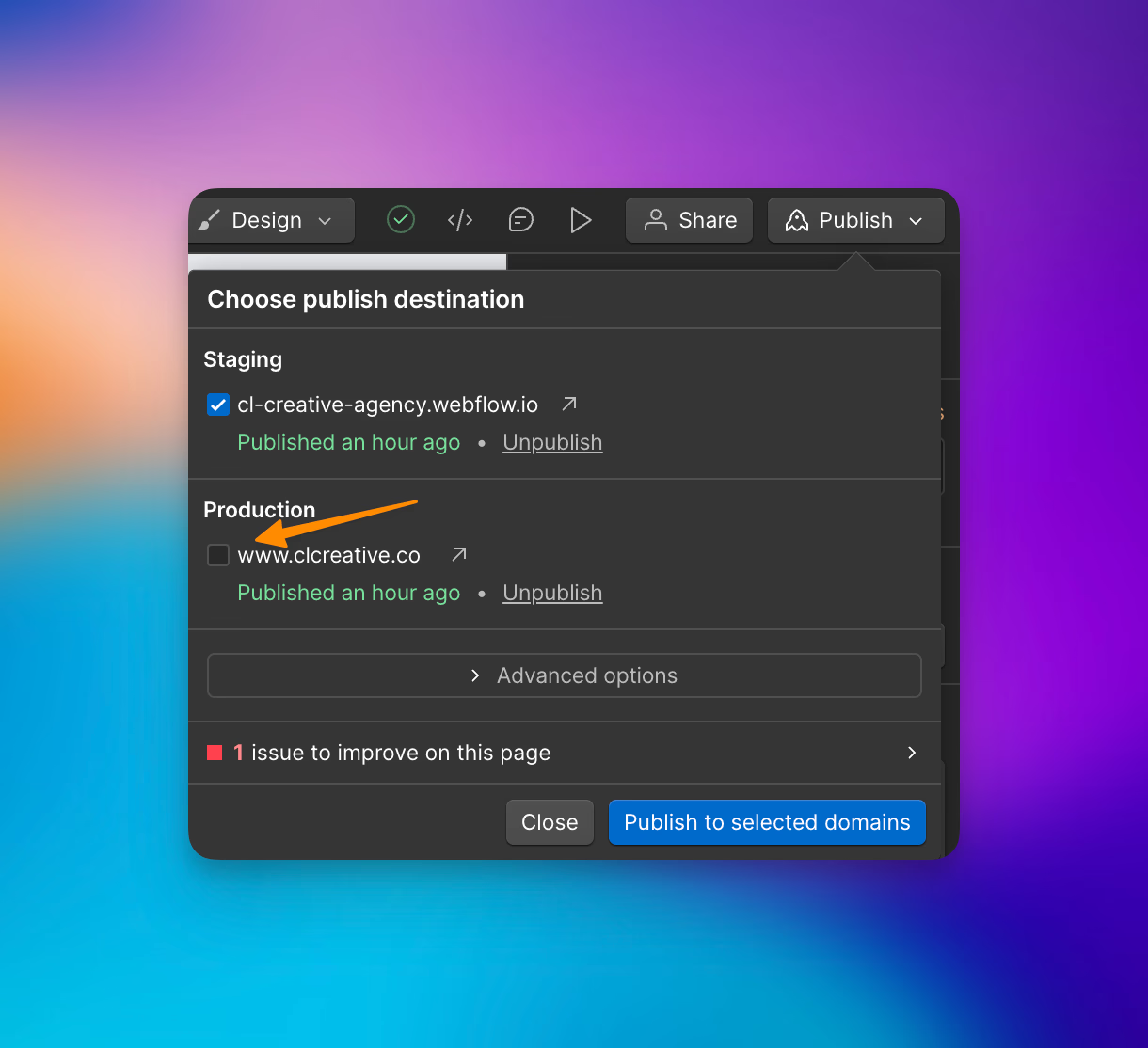
This is also why it is important to test your setup on a staging domain before going live. Be sure to uncheck the production domain so that only your staging domain is checked before publishing.
Note: Be sure to recheck production domain box when you want to go live and publish your new slider to the world!
Step 2: Setting Up Your CSS Embed

Next, you’ll need to import Swiper's CSS and add your own custom styles. Since Webflow doesn’t allow for direct CSS styling in the Designer unless it's in an Embed element, it’s best to place both Swiper’s default CSS and your custom styles into an HTML Embed.
Swiper’s default CSS is pulled in via a CDN link, which won’t show in the Designer, but any custom styling you add inside the embed will show in the Designer.
Swiper CSS and Custom Styling
Here’s the updated code you can add to your CSS Embed element. Alternatively, you could style these elements directly inside of the Designer. I have chosen to style them all inside the embed so I can provide the code to you in this tutorial and for easy importing into new projects.
Pagination Bullets
The only element you won’t be able to style directly in the designer - at least with this setup, would be the pagination bullets. Swiper creates them for us on page load, so we need to style these with custom CSS.
Unless we create placeholders in the Webflow Designer that mimic what the final pagination bullets will look like. Then you can style them using Webflow’s style panel.
But note, these are not the bullets that show on page load. Instead, Swiper adds these bullets in for us.
There is a way to use custom bullets, or what Swiper refers to as Unique Nav Elements, but we are not going over that in this tutorial. See Swiper’s documentation on Unique Nav Elements.
Navigation Buttons Background Color
You’ll notice a combo class on my navigation buttons in the following CSS. I have a utility class setup in my project that will add a gradient to any element that has this combo class. .swiper-button-next-portfolio.background-color-blue-gradient This is why you won’t see any rules in the CSS, just the combo class applied to the buttons.
If you don’t have a combo class setup in your project to apply background colors, then you can style the background color (assuming you want a background color) directly on the button class.
For example, I would add a rule to this CSS selector: .swiper-button-next-portfolio that handles the background color.
<!-- Swiper JS CSS -->
<link
  rel="stylesheet"
  href="https://cdn.jsdelivr.net/npm/swiper@11/swiper-bundle.min.css"
/>

<style>
/* Container for the entire Swiper component */
.swiper-component.is-portfolio {
    position: relative;  /* Creates a positioning context for absolute elements inside */
}

/* Main swiper container */
.swiper.is-portfolio {
     /* Can use this to override Swiper default styles like overflow:hidden; */
}

/* Individual slide styling */
.swiper-slide.is-portfolio {
    border-radius: var(--border-radius); /* Adds a border radius to the slide */
    overflow: clip; /* Clips any content outside the slide so border radius is present */
}

/* Image styling within slides */
.swiper-slide.is-portfolio img {
    width: 100%;  /* Makes images take up full width of slide */
    height: 100%;  /* Makes images take up full height of slide */
    object-fit: cover;  /* Ensures images fill space without distortion */
    aspect-ratio: 8.4/6.3;  /* Maintains consistent image dimensions with 8.4:6.3 ratio */
}

/* Container for the navigation arrows */
.swiper-arrow-wrapper.is-portfolio {
    display: flex;  /* Creates a horizontal layout for arrows */
    margin-top: 1rem;  /* Adds space above the arrows */
    grid-column-gap: 1rem;  /* Horizontal spacing between arrows when using grid */

}

/* Hide arrow navigation on mobile screens (below 480px) */
@media (max-width: 480px) {
    .swiper-arrow-wrapper.is-portfolio {
        display: none;  /* Removes arrow navigation from view on small screens */
    }
}

/* Styles for the "Next" arrow button */
.swiper-button-next-portfolio {
    position: relative;  /* Enables positioning context */
    z-index: 11;  /* Ensures arrow stays above slider content */
    display: flex;  /* Creates flex container for centering icon */
    overflow: clip;  /* Clips any content outside the button */
    width: 3rem;  /* Sets fixed width */
    height: 3rem;  /* Sets fixed height */
    justify-content: center;  /* Centers icon horizontally */
    align-items: center;  /* Centers icon vertically */
    aspect-ratio: 1/1;  /* Maintains square shape */
}

/* Hover effect for next arrow */
.swiper-button-next-portfolio:hover {
    opacity: 0.8;  /* Slightly fades the button on hover */
}

/* Class for applying gradient background to next arrow */
.swiper-button-next-portfolio.background-color-blue-gradient {
    /* Empty class - ready for gradient background styles */
}

/* Styles for the "Previous" arrow button */
.swiper-button-prev-portfolio {
    position: relative;  /* Enables positioning context */
    z-index: 11;  /* Ensures arrow stays above slider content */
    display: flex;  /* Creates flex container for centering icon */
    overflow: clip;  /* Clips any content outside the button */
    width: 3rem;  /* Sets fixed width */
    height: 3rem;  /* Sets fixed height */
    justify-content: center;  /* Centers icon horizontally */
    align-items: center;  /* Centers icon vertically */
    aspect-ratio: 1/1;  /* Maintains square shape */
}

/* Hover effect for previous arrow */
.swiper-button-prev-portfolio:hover {
    opacity: 0.8;  /* Slightly fades the button on hover */
}

/* Class for applying gradient background to previous arrow */
.swiper-button-prev-portfolio.background-color-blue-gradient {
    /* Empty class - ready for gradient background styles */
}

/* Styles for the arrow icons */
.swiper_arrow-icon.is-portfolio {
    width: 1.5rem;  /* Sets icon width */
    height: 1.5rem;  /* Sets icon height */
    color: var(--text--secondary);  /* Uses CSS variable for icon color */
}

/* Pagination dots container */
.swiper-pagination.is-portfolio {
   	position: relative;  /* Default is absolute */
}

/* Adds margin to pagination on mobile screens (below 480px) */
@media (max-width: 480px) {
    .swiper-pagination.is-portfolio {
        margin-top: 2rem;  /* Adds margin top on small screens */
    }
}

/* Individual pagination bullet styling */
.swiper-pagination-bullet {
    background-color: var(--background--alternate);  /* Uses CSS variable for inactive bullet color */
}

/* Active pagination bullet styling */
.swiper-pagination-bullet.swiper-pagination-bullet-active {
    width: 15px;  /* Makes active bullet wider for better visibility */
    border-radius: 24px;  /* Creates pill shape for active bullet */
    background-color: var(--background--primary);  /* Uses CSS variable for active bullet color */
}

</style>
Why Use an Embed for CSS?
By keeping the CSS in an Embed element, you can view styling changes live in the Webflow Designer. This is much more convenient than placing the CSS in your page settings, which would only reflect changes once published.
Using and Embed also allows you to more easily create a Swiper Component and add it to another page in your project.
Step 3: Adding JavaScript for Swiper Initialization
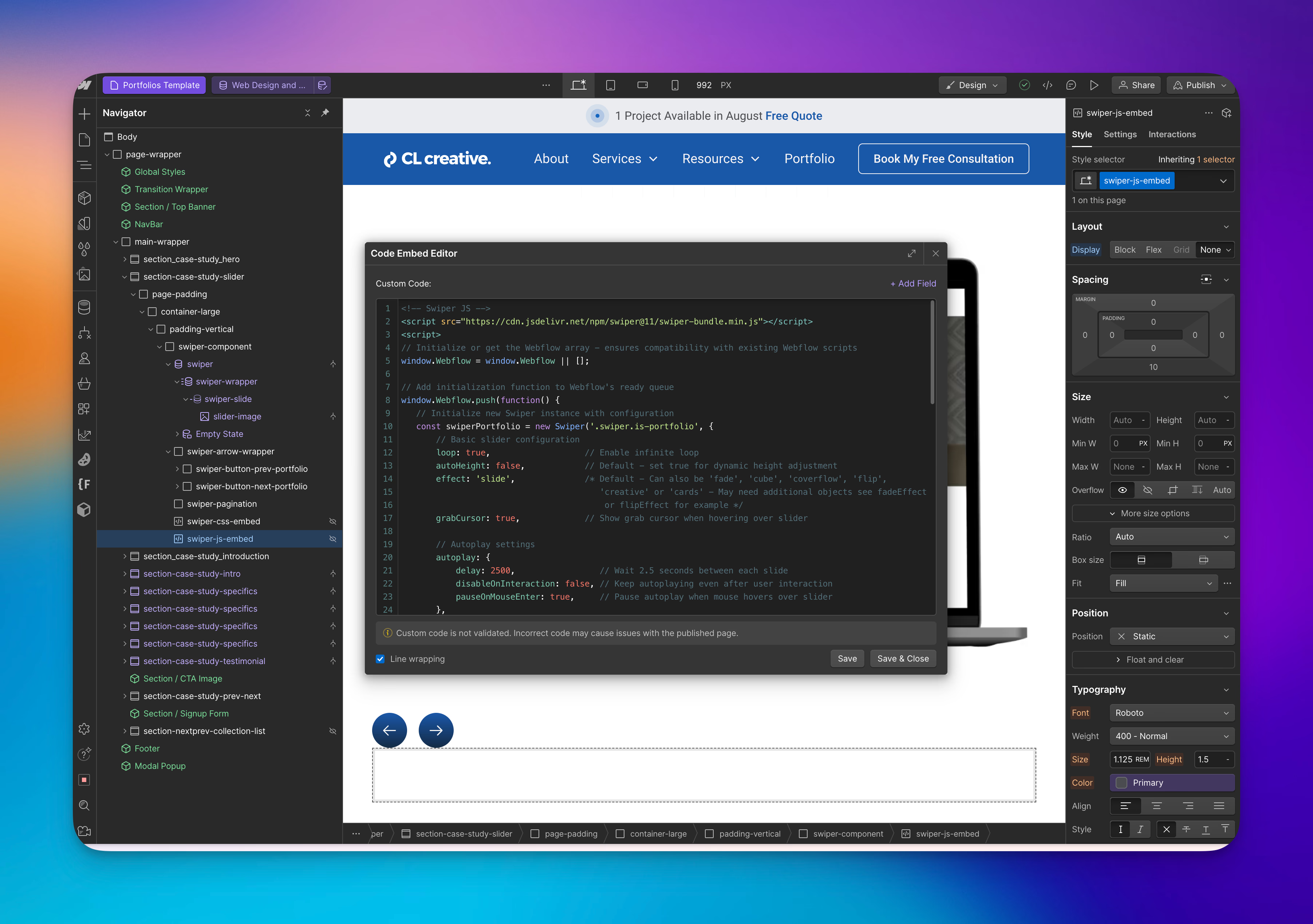
The next step is to add JavaScript for initializing the Swiper slider.
Separate Embed for JS
You should create a separate Embed element for the JavaScript code so Webflow will render the CSS in your embed in the Designer. If you add them both - CSS and JS - to the same embed, your custom CSS will not be rendered in the Designer, only on the published website.
Swiper JS Setup
You will notice I have added a few lines of JS to the standard JS setup, but not many. I made note of defaults in the JS below. I included these defaults explicitly in the code since there are other options I might choose in the future to use. Instead of having to refer back to the documentation, I have them already in my code.
I have done the following, which are not defaults:
- I changed the default Swiper variable to
const swiperPortfolio = new Swiper('.swiper.is-portfolio',in order to account for any other Swiper Instances I might add into my project. This will help avoid conflicts and remind me exactly what page this code is supposed to go on. Notice also, I am targeting the slider with the combo class.swiper.is-portfolio- The default setup variable is
const swiperand the class it targets by default is.swiper
- The default setup variable is
- I set
loop: trueso the slides will loop. - I added a
grabCursorso users would know they can grab and advance the slides on desktop. - I added
autoplay. Inside the autoplay object,- I added
disableOnInteractionso that the slides would keep playing. - As well as
pauseOnMouseEnterso someone could look a the slide in more detail if they were interested without the annoyance of it playing while they are trying to view it.
- I added
- I added
keyboardso the slides could be advanced with they keyboard for better accessibility.- I also added the
onlyInViewportoption so the slides would only advance via the keyboard while the slider is in the viewport.
- I also added the
- I made it so that
paginationshows in the project by adding the pagination object.- As well as I added
clickable: ‘true’so that you can click on the pagination bullets to advance the slides.
- As well as I added
- I changed the default elements the
navigationshould target to match my HTML above - I added
breakpointsso I could control how many slides show along with their spacing on different screen sizes.- A note about breakpoints, they cascade up from mobile instead of down from desktop. This is different behavior than in CSS, but it is important to take note of the difference.
Here’s the script to add to your project:
<!-- Swiper JS -->
<script src="https://cdn.jsdelivr.net/npm/swiper@11/swiper-bundle.min.js"></script>
<script>
// Initialize or get the Webflow array - ensures compatibility with existing Webflow scripts
window.Webflow = window.Webflow || [];

// Add initialization function to Webflow's ready queue
window.Webflow.push(function() {
   // Initialize new Swiper instance with configuration
   const swiperPortfolio = new Swiper('.swiper.is-portfolio', {
       // Basic slider configuration
       loop: true,                   // Enable infinite loop
       autoHeight: false,            // Default - set true for dynamic height adjustment
       effect: 'slide',              /* Default - Can also be 'fade', 'cube', 'coverflow', 'flip',
       																	'creative' or 'cards' - May need additional objects see fadeEffect
                                         or flipEffect for example */
       grabCursor: true,             // Show grab cursor when hovering over slider

       // Autoplay settings
       autoplay: {
           delay: 2500,                 // Wait 2.5 seconds between each slide
           disableOnInteraction: false, // Keep autoplaying even after user interaction
           pauseOnMouseEnter: true,     // Pause autoplay when mouse hovers over slider
       },

       // Enable keyboard
       keyboard: {
    			 enabled: true,							// Default is false
           onlyInViewport: true,			// Enabled only when slider is visible in viewport
  		 },

       // Pagination configuration
       pagination: {
           el: '.swiper-pagination.is-portfolio',  // CSS selector for pagination container
           type: 'bullets',												 // Type of pagination
           clickable: true,              					 // Make pagination bullets clickable
       },

       // Navigation arrows configuration
       navigation: {
           nextEl: '.swiper-button-next-portfolio',  // CSS selector for "next" button
           prevEl: '.swiper-button-prev-portfolio',  // CSS selector for "previous" button
       },

       // Default parameters
       /* Swiper's base breakpoint is Mobile - Swiper Cascades up instead of down like CSS */
  		 slidesPerView: 1, 							  // Show 1 full slide
  		 spaceBetween: 16, 							  // 16px gap between slides

       // Responsive design breakpoints
       breakpoints: {
           /* Mobile devices (320px and up) */

           320: {
               slidesPerView: 1,        // Show 1 full slide
               spaceBetween: 16,        // 16px gap between slides
           },
           // Tablet devices (768px and up)
           768: {
               slidesPerView: 1.5,      // Show 1.5 slides (peek next slide)
               spaceBetween: 32,        // 32px gap between slides
           },
           // Desktop devices (992px and up)
           992: {
               slidesPerView: 1.5,      // Show 1.5 slides (peek next slide)
               spaceBetween: 48,        // 48px gap between slides
           }
       }
   });
});
</script>
Why Use a Separate Embed for JavaScript?
Keeping JavaScript separate from CSS in different Embed elements allows you to maintain clear visibility of your styles in Webflow's Designer.
If the JavaScript and CSS are combined, the CSS will only apply once the site is published, making it challenging to visualize your design changes in real-time.
Why Use Swiper JS Instead of Webflow's Native Slider?
While Webflow's native slider is easy to use, it has limitations.
One significant drawback is that it lacks CMS support and fine control over settings such as lazy-loading, autoplay customization, and responsive breakpoints.
Additionally, the native slider is not easily adjustable, can be clunky, and difficult to use.
Swiper JS provides much greater flexibility, allowing you to create a more tailored user experience with smooth transitions, precise navigation options, and more.
Additionally, Swiper JS is better suited for projects with multiple sliders, as it provides clear distinction and customization options with combo classes.
Step 4: Publishing and Testing
After adding the HTML structure, CSS, and JavaScript, it's time to publish your site to see Swiper in action. While the CSS will show live in the Designer, the JavaScript (which controls the Swiper behavior) will only activate on a published page.
Make sure to test the slider on different devices to ensure it looks great at all breakpoints. Swiper offers options like lazy-loading, autoplay, and configurable navigation that make for a seamless user experience, some of which we have used in our project.
For a full list of all the options you can use with Swiper, please see Swiper JS’s documentation.
Swiper JS also offers a number of examples complete with all the necessary code to implement it into your project. You can view those examples here.
Summary
Swiper JS is an excellent JavaScript library to know as it provides more flexibility and advanced customization compared to Webflow's native slider.
Adding Swiper JS to your Webflow project can significantly improve the visual impact of your site by offering a beautiful, interactive slider that can be CMS driven.
With this slider setup, we have only scratched the surface of what is possible with Swiper JS. There are many more advanced setups that allow you to take your project to the next level. We will explore some of these setups in future tutorials.
But understanding this basic setup is crucial for exploring more advanced topics, so take some time to study it and implement it into your projects.
Try it out and see how it elevates your Webflow project!
End to End Webflow Design and Development Services
From Web Design and SEO Optimization to Photography and Brand Strategy, we offer a range of services to cover all your digital marketing needs.

Webflow Web Design
We design custom Webflow websites that are unique, SEO optimized, and designed to convert.
Webflow Support
Get dedicated design and development support from a Webflow Professional Partner without the overhead of a full-time hire or the hassle of one-off project quotes.
Claim Your Design Spot Today
We dedicate our full attention and expertise to a select few projects each month, ensuring personalized service and results.
