Definition
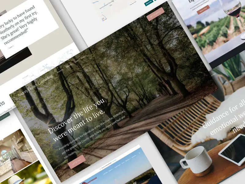
A Banner is a graphical element, typically displayed at the top, bottom, or side of a webpage, that is used for advertising, announcements, or promotional purposes.
Banners often contain images, text, and links to direct users to a specific webpage or action, and they are an essential tool in digital marketing and web design.
When should you use a Banner?
You should use a Banner when:
- Promoting special offers, discounts, or sales events.
- Displaying important announcements or updates to website visitors.
- Highlighting new products, services, or content.
- Encouraging user actions such as sign-ups, downloads, or social media follows.
- Monetizing your website through advertising partnerships.
How should you use a Banner?
To use a Banner effectively, follow these steps:
- Define the Purpose: Determine the goal of the banner, such as increasing sales, driving traffic, or raising awareness.
- Design Visually Appealing Banners: Create banners with attractive images, compelling text, and a clear call to action (CTA). Use design tools like Adobe Photoshop, Canva, or online banner generators.
- Placement: Position the banner strategically on your webpage to maximize visibility without disrupting the user experience.
- Responsive Design: Ensure the banner is responsive and displays correctly on different devices and screen sizes.
- Linking: Include links in the banner to direct users to the relevant landing page or action.
- Track Performance: Use analytics tools to monitor the performance of your banners, including click-through rates (CTR) and conversion rates.
Example of a simple HTML banner:
<!DOCTYPE html>
<html lang="en">
<head>
    <meta charset="UTF-8">
    <meta name="viewport" content="width=device-width, initial-scale=1.0">
    <title>Banner Example</title>
    <style>
        .banner {
            background-color: #4CAF50;
            color: white;
            text-align: center;
            padding: 20px;
            position: relative;
        }
        .banner a {
            color: white;
            text-decoration: none;
            font-weight: bold;
        }
    </style>
</head>
<body>
    <div class="banner">
        <p>Special Offer: Get 50% off on all products! <a href="/sale">Shop Now</a></p>
    </div>
</body>
</html>
What is a real-world example of Banners in action?
A real-world example of Banners in action is the promotional banners on e-commerce websites like Amazon. During events like Black Friday or Cyber Monday, Amazon uses banners to announce special deals and discounts, encouraging users to explore and purchase discounted products. These banners are strategically placed on the homepage and category pages to attract maximum attention.
What are some precautions to take when working with Banners?
When working with Banners, consider the following precautions:
- Avoid Clutter: Ensure the banner does not clutter the webpage or distract from the main content.
- Relevance: Make sure the banner content is relevant to the audience and context of the webpage.
- Load Times: Optimize images and scripts to ensure the banner does not negatively impact page load times.
- Adherence to Policies: Follow advertising and content policies of platforms where the banner will be displayed.
- Accessibility: Ensure the banner is accessible to all users, including those using assistive technologies.
What are the advantages of using Banners?
- Visibility: Banners are highly visible and can capture users' attention quickly.
- Versatility: They can be used for various purposes, including advertising, announcements, and promotions.
- Engagement: Well-designed banners with compelling CTAs can drive user engagement and actions.
- Monetization: Banners can generate revenue through advertising partnerships.
- Brand Awareness: They help in increasing brand awareness by showcasing products, services, or promotions.
What are the limitations of using Banners?
- Banner Blindness: Users may develop a tendency to ignore banners, reducing their effectiveness.
- Ad Blockers: Some users use ad blockers, which can prevent banners from being displayed.
- Distraction: Poorly designed or intrusive banners can distract users and degrade the user experience.
- Limited Space: Banners have limited space, requiring concise and impactful messaging.
What are common mistakes to avoid with Banners?
- Overloading with Information: Avoid cramming too much information into the banner, which can overwhelm users.
- Poor Design: Ensure the banner is visually appealing and aligns with the overall design of the website.
- Weak CTAs: Use strong, clear calls to action to guide users on what to do next.
- Ignoring Mobile Users: Ensure the banner is responsive and works well on mobile devices.
- Not Testing: Regularly test different banner designs, placements, and content to find what works best.
How does Banner compare to similar technologies or methods?
- Banner vs. Pop-Up: Banners are typically embedded in the webpage, while pop-ups appear over the content and can be more intrusive. Pop-ups can be more attention-grabbing but may also annoy users.
- Banner vs. Inline Ads: Inline ads are placed within the content flow, while banners are usually placed at the top, bottom, or sides of the webpage. Banners can be more noticeable, while inline ads integrate more seamlessly with the content.
- Banner vs. Sidebar Ads: Sidebar ads are placed in the sidebars of a webpage. Banners, particularly top banners, are generally more prominent but sidebar ads can offer additional space for information.
What are best practices for Banners?
- Keep it Simple: Use concise messaging and a clean design to make the banner effective.
- High-Quality Visuals: Use high-quality images and graphics to attract attention.
- Strong CTAs: Include clear and compelling calls to action to drive user engagement.
- Optimize for Speed: Ensure the banner does not slow down the page load time.
- Test and Optimize: Regularly test different banner designs, placements, and content to optimize performance.
By understanding and applying these aspects of Banners, you can create engaging, effective, and visually appealing promotional elements that enhance your website and drive user actions.


