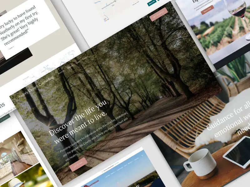
Definition
Center refers to the positioning of elements in web design such that they are aligned to the middle of their containing element, both horizontally and/or vertically.
Centering can be applied to text, images, divs, and other HTML elements to create a balanced and aesthetically pleasing layout.
When should you use Center?
You should use Center when you want to draw attention to specific content by placing it prominently in the middle of its container.
Centering is useful for headlines, buttons, and images that need to stand out.
It is also effective in creating clean, symmetric designs and ensuring elements are visually balanced.
Use centering for aligning forms, modals, and other UI components to enhance user experience.
How should you use Center?
To use Center effectively, follow these steps:
- Horizontal Centering with CSS: Use CSS properties like
text-align: center for text or margin: auto for block-level elements. - Vertical Centering with CSS: Use CSS properties like
display: flex and align-items: center for vertical centering within a flex container. - Combine Flexbox for Both Axes: Use
display: flex, justify-content: center, and align-items: center to center elements both horizontally and vertically. - Use CSS Grid for Centering: Use CSS Grid properties like
display: grid, place-items: center to center elements.
Example of horizontal and vertical centering using Flexbox:
<!DOCTYPE html>
<html lang="en">
<head>
    <meta charset="UTF-8">
    <meta name="viewport" content="width=device-width, initial-scale=1.0">
    <title>Centering Example</title>
    <style>
        .container {
            display: flex;
            justify-content: center;
            align-items: center;
            height: 100vh; /* Full viewport height */
            border: 1px solid #333;
        }
        .centered-content {
            text-align: center;
        }
    </style>
</head>
<body>
    <div class="container">
        <div class="centered-content">
            <h1>Centered Heading</h1>
            <p>This content is centered both horizontally and vertically.</p>
        </div>
    </div>
</body>
</html>
What is a real-world example of Center in action?
A real-world example of Center in action is a website's hero section.
The hero section often features a large heading and a call-to-action button centered both horizontally and vertically within the viewport.
This design draws the user's attention immediately to the most important message or action.
What are some precautions to take when working with Center?
When working with Center, consider the following precautions:
- Avoid Overuse: Over-centering can lead to a monotonous design; use it sparingly for key elements.
- Responsive Design: Ensure centered elements remain properly aligned across different screen sizes and devices.
- Accessibility: Make sure centered elements are still accessible and readable, especially for users with visual impairments.
- Performance: Avoid complex centering techniques that can affect page load performance.
What are the advantages of using Center?
- Visual Appeal: Creates a balanced and aesthetically pleasing layout.
- Focus Attention: Draws users' attention to important content or actions.
- Symmetry: Enhances the symmetry and organization of the design.
- User Experience: Improves user experience by making key elements easy to find and interact with.
What are the limitations of using Center?
- Monotony: Overuse of centered elements can lead to a boring and repetitive design.
- Complex Layouts: Centering elements in complex layouts can be challenging and require more advanced techniques.
- Responsive Issues: Ensuring centered elements stay properly aligned on all screen sizes can be difficult.
What are common mistakes to avoid with Center?
- Over-Centering: Avoid centering too many elements, which can detract from the impact of key content.
- Ignoring Context: Ensure centering aligns with the overall design context and layout structure.
- Poor Accessibility: Make sure centered text and elements remain readable and accessible to all users.
- Not Testing Across Devices: Failing to test centering on different devices and screen sizes can lead to layout issues.
How does Center compare to similar technologies or methods?
- Center vs. Left Align: Centering aligns elements in the middle, while left align aligns them to the left margin, often used for readability and traditional layouts.
- Center vs. Right Align: Right align aligns elements to the right margin, used less frequently but effective for certain design elements like dates in lists.
- Center vs. Justify: Justify spreads elements across the width of the container, often used for text to create a clean, block-like appearance.
- Center vs. Flexbox/Grid: Flexbox and Grid are layout models that provide powerful tools for centering and aligning elements in various ways.
What are best practices for Center?
- Use for Key Elements: Center key elements like headings, CTAs, and hero content to draw attention.
- Combine Techniques: Use Flexbox or Grid for more advanced centering techniques.
- Responsive Design: Ensure centered elements adapt well to different screen sizes and devices.
- Maintain Balance: Balance centered elements with other alignment techniques to create a dynamic and engaging layout.
- Test Thoroughly: Regularly test centered elements across various devices and screen sizes to ensure proper alignment.
What resources are available for learning more about Center?
- MDN Web Docs: Comprehensive documentation on CSS properties for centering elements.
- CSS-Tricks: Articles and tutorials on different methods for centering elements in CSS.
- Smashing Magazine: Resources on web design best practices, including centering techniques.
- "CSS Mastery" by Andy Budd: A book that covers advanced CSS techniques, including centering.
- FreeCodeCamp: Interactive tutorials on HTML and CSS, including centering elements.
By understanding and applying these aspects of Center, you can create visually appealing and balanced web designs that effectively highlight key content and improve user experience.


