Web Design
What are the Key Elements of Good Web Design?

Good website design is more important than ever. In today’s modern world, a website is the first point of contact between a business and its potential customers.
This means that good web design is not just about aesthetics; it's a crucial factor in:
- User engagement
- Brand perception
- and ultimately, business success.
A well-designed website can captivate visitors, enhance user experience, and lead to higher conversion rates.
Understanding Good Web Design
Good web design seamlessly blends visual appeal with functionality and user experience.
It's not just about making a site look attractive; it's about creating an intuitive, accessible, and engaging platform where visitors can easily find what they need.
Key Elements of Good Web Design
Good web design is pivotal in creating a positive and lasting impression, as well as driving the success of your business. That means its important to understand the key components of good web design.
We don’t have the time or space to explore the elements in detail. We’ll do that in subsequent articles. But to begin, it is important we understand what makes a website design good?
So what are the key components of effective web design?
User-Friendly Navigation
Navigation is the roadmap of a website.
Good web design ensures that this roadmap is clear and intuitive, helping users find information quickly and effortlessly.
This includes a well-structured layout, logical menu arrangements, and easy-to-understand labeling.
A website’s navigation should make it easy for visitors to find that for which they are looking. Pay attention to your menus and the structure of your website. Your website’s navigation should guide users where you want them to go.
Responsive Design
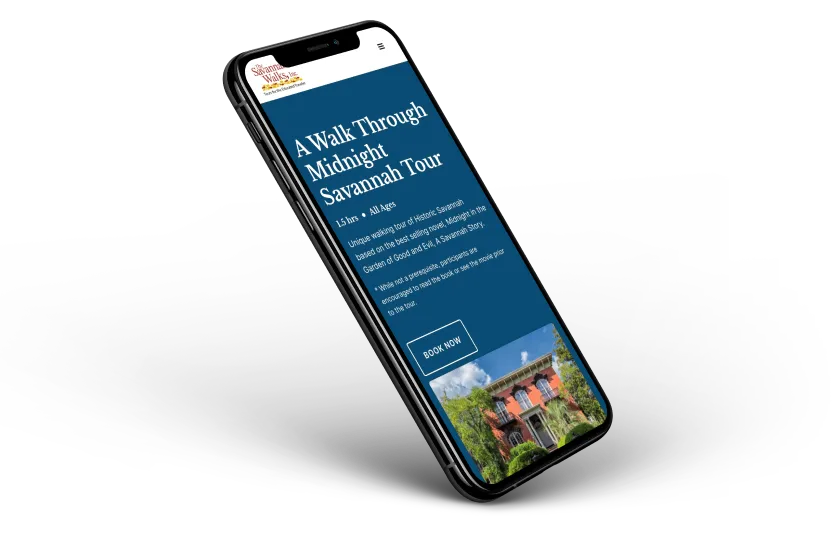
With the proliferation of devices with varying screen sizes, responsive design has become non-negotiable. Just think about your own household. How many different screens do you have and what are their sizes?
In my house, I have three four different screens myself. They all are different sizes. Counting my wife and kids, in all there are 8 different screens in our house. They are all different sizes.
Good web design accounts for these different sizes, making sure that a website looks good on every device.
The technical term is called responsive design.
A responsive website automatically adjusts to fit the device it's being viewed on, ensuring a consistent user experience across all platforms.
Visual Hierarchy
Visual hierarchy refers to the arrangement of elements in a way that implies importance.
It guides the visitor's attention to key sections and ensures that the message is conveyed effectively.
Techniques include the use of size, color, contrast, and spacing.
Taking size for example, every element on your website shouldn’t be the same size. Take this blog post you are reading as an use case. At the top, you will find the H1 heading. It is larger in size than all the other headings on this page. That symbolizes importance. It is what the article is about.
Then you have H2 and H3 headings. The H2 headings are larger than the H3 headings. That is because H2 headings are structural sign posts that a new section has started. H3 headings serve as the supporting information or structure of that new section.
Then you have the paragraphs. These are not as large as any of the headings. For one, that would be super hard to read. But two, it tells you, as the reader, more information about the heading.
Visual hierarchy serves to guide you through the page. It helps you find the information that most interests you. As well as it tells you what is most important.
Learn more about Visual Hierarchy in this article.
Content Clarity
Content is king in web design.
Clear, concise, and engaging content not only informs the user but also enhances the overall user experience.
It involves using legible fonts, succinct messaging, and compelling call-to-actions.
If your content is not clear, your message is muddled and your sales will suffer. Getting your content write is probably more important than that flashy design you are prioritizing.
Fancy design elements shouldn’t supersede content. Instead, they should support the content and guide users so that the content is presented in an easy to digest format.
I see so many websites that prioritize flashy design at the expense of the content. These websites might win awards on awwwards.com but they are most likely not doing their job - which is to support and guide users to the content so that they are converted into customers or leads.
If you'd like to learn more about copywriting, check out our article: Mastering Copywriting: A Comprehensive Guide for Business Owners
Aesthetic Appeal
While functionality is key, the aesthetic appeal cannot be overlooked.
A visually appealing website can make a lasting impression.
This involves:
- A harmonious color scheme
- High-quality images
- A design that aligns with the brand's identity.
Loading Time and SEO
Website loading time is a critical aspect of user experience and impacts SEO.
Faster websites rank higher in search engines and retain users better.
Optimizing images, using efficient coding, and leveraging browser caching are ways to improve loading times.
If you want to learn more about how to speed up your website’s load time, check out our article Boost Your Website Load Times
Consistency
Consistency in design elements like colors, fonts, and layout styles helps in building brand recognition and trust.
It ensures a cohesive user experience and strengthens the brand's identity.
If your colors, fonts, and layout are not consistent, you run the risk of looking amateurish. And those who don’t look professional are not taken serious and are often seen as untrustworthy. People don’t buy or hire those they don’t trust.
So if you want to increase your leads and sales, maintain a consistent theme across your entire website.
The best way to make sure your website remains consistent, it to create a style guide and stick to it.
Conclusion
Good web design is a blend of art and science.
It requires an understanding of:
- User behavior
- Design principles
- And technical aspects of how the web works.
By focusing on these key elements, businesses can create websites that are not just visually pleasing but also functional and user-centric.
Whether you're looking to design a new website or revamp an existing one, remember that good web design can be the difference between a thriving business and a forgotten one.
If you are looking for someone to help evaluate your website's design, reach out. We offer free website consultations.
End to End Webflow Design and Development Services
From Web Design and SEO Optimization to Photography and Brand Strategy, we offer a range of services to cover all your digital marketing needs.

Webflow Web Design
We design custom Webflow websites that are unique, SEO optimized, and designed to convert.
Webflow Maintenance
Gain peace of mind knowing that a Webflow Professional Partner is maintaining your website.

Claim Your Design Spot Today
We dedicate our full attention and expertise to a select few projects each month, ensuring personalized service and results.


