Definition
"Above the Fold" is a term originating from newspaper publishing, referring to the upper half of the front page, which is visible when the newspaper is folded.
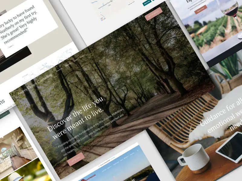
In web design, it refers to the portion of a webpage that is visible without scrolling.
This area is considered highly valuable for capturing users' attention and delivering key messages.
When should you use Above the Fold?
You should focus on the above-the-fold area when you need to:
- Ensure that the most important content or call-to-action is immediately visible to users.
- Capture user attention quickly to reduce bounce rates.
- Highlight key messages, promotions, or announcements.
- Improve the overall user experience by presenting essential information upfront.
How should you use Above the Fold?
To effectively use the above-the-fold area, follow these best practices:
- Prioritize Content: Place the most important content, such as headlines, key messages, and call-to-action buttons, in the above-the-fold area.
- Optimize for Speed: Ensure that above-the-fold content loads quickly to avoid delays that could frustrate users.
- Responsive Design: Design for various screen sizes and resolutions to ensure that the above-the-fold content is optimized for different devices.
- Visual Hierarchy: Use visual hierarchy principles to guide users' eyes to the most critical elements first.
- Engaging Visuals: Include high-quality images or videos to capture attention, but balance them with fast loading times.
What is a real-world example of Above the Fold in action?
A real-world example of above-the-fold content is the homepage of an e-commerce website like Amazon. The top section of the page displays key promotional banners, search bars, and main navigation links. This area is designed to grab the user's attention immediately, presenting the most relevant and important information upfront to drive engagement and conversions.
What are some precautions to take when working with Above the Fold?
When designing for the above-the-fold area, consider the following precautions:
- Avoid Clutter: Do not overload the above-the-fold area with too much information. Keep it clean and focused on key messages.
- Test Across Devices: Ensure that the content looks good and functions well across various devices and screen sizes.
- Balance Content: While above-the-fold is important, don’t neglect the content below the fold. Ensure that the entire page provides value and encourages further exploration.
- Loading Speed: Optimize images and scripts to ensure that the above-the-fold content loads quickly to keep users engaged.
What are the advantages of using Above the Fold?
- Immediate Engagement: Captures users' attention quickly, reducing bounce rates.
- Visibility: Ensures that the most critical content is seen first without requiring any user action.
- User Experience: Enhances the user experience by presenting key information upfront.
- Higher Conversion Rates: Well-designed above-the-fold content can lead to higher engagement and conversion rates.
What are the limitations of using Above the Fold?
- Limited Space: The above-the-fold area has limited space, which can be a challenge for fitting all important elements.
- Varied Viewports: Different screen sizes and resolutions mean that the above-the-fold content can vary significantly between devices.
- Overemphasis: Focusing too much on above-the-fold content can lead to neglecting important information that falls below the fold.
What are common mistakes to avoid with Above the Fold?
- Ignoring Below the Fold: Neglecting the content that falls below the fold, which can provide valuable information and engagement opportunities.
- Overloading Content: Cramming too much information into the above-the-fold area, leading to a cluttered and overwhelming experience.
- Slow Loading Times: Using large images or heavy scripts that slow down the loading of above-the-fold content, frustrating users.
- Poor Design: Failing to use visual hierarchy and design principles to guide users' attention effectively.
How does Above the Fold compare to similar technologies or methods?
- Above the Fold vs. Below the Fold: Above-the-fold content is visible without scrolling, while below-the-fold content requires users to scroll. Both areas are important, but above-the-fold content is crucial for immediate engagement.
- Above the Fold vs. Hero Image: A hero image is often placed in the above-the-fold area to capture attention with a large, impactful visual. The hero image is a component of the above-the-fold strategy.
- Above the Fold vs. Full-Screen Intro: A full-screen intro may use the entire viewport to present key information or visuals, effectively using the above-the-fold area for immersive engagement.
What are best practices for Above the Fold?
- Prioritize Key Elements: Ensure that the most important content, such as headlines and calls to action, is placed above the fold.
- Optimize Load Times: Use optimized images and scripts to ensure fast loading times for above-the-fold content.
- Design Responsively: Ensure that the above-the-fold content is responsive and looks good on all devices and screen sizes.
- Test User Experience: Conduct usability testing to see how users interact with above-the-fold content and make improvements based on feedback.
- Balance Content: While focusing on above-the-fold, ensure that the rest of the page also provides value and engages users.
What resources are available for learning more about Above the Fold?
- MDN Web Docs: Documentation and best practices for web design and layout.
- Smashing Magazine: Articles and tutorials on web design principles, including above-the-fold strategies.
- UX Design: Resources and articles on user experience design, focusing on engaging content placement.
- "Don't Make Me Think" by Steve Krug: A book on web usability and design principles, including the importance of above-the-fold content.
By understanding and applying these aspects of designing for the above-the-fold area, you can create engaging, user-friendly webpages that capture attention and drive action from the moment users land on your site.


